 Our focus remains on the Hope Rally. Intermediate Term Count Update (11/4/11) presents three main tracking counts. The following charts offer update for
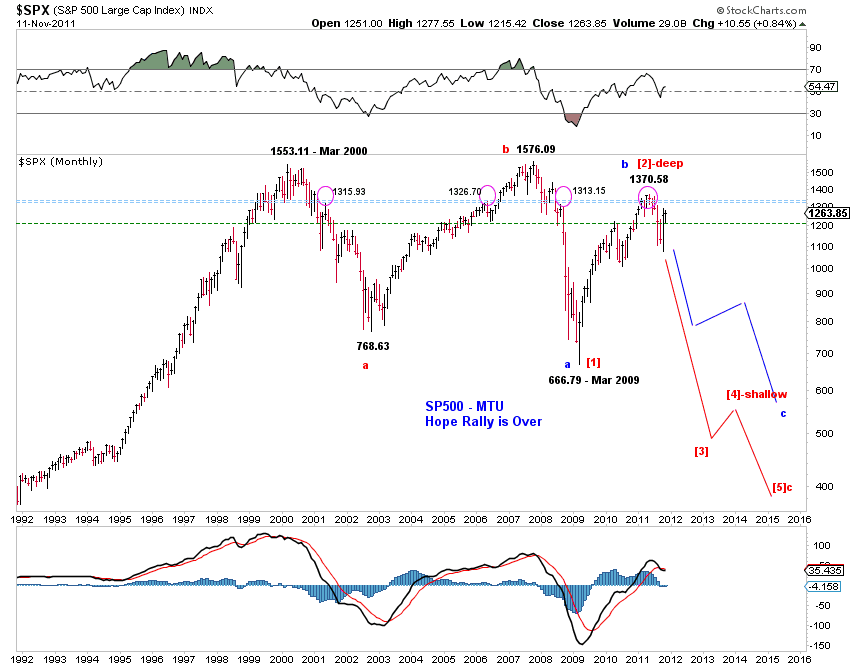
(1) Hope Rally is over (Chart 1, right).
(2) Hope Rally is still in progress (Chart 2).
(3) It's a bull market (Chart 3).


Hope ...
There are a number of bullish near term (days/weeks) and intermediate term (weeks/months) developments for U.S. stocks.
 First, potential triangle price patterns set the stage for the next advance in stocks.
 Chart 4 and Chart 5 below highlight potential triangles in the Dow and the Nasdaq 100. Similar price patterns can be found in SPX and the Nasdaq composite.
Triangles, being continuation patterns, imply that recent recovery is likely to continue. Since the triangle in NDX is already complete, the pullback in SPX/INDU may be complete as well with the coming retrace being a small degree 2nd wave rather than wave E of a developing triangle. For example, the transports have already made a higher high, invalidating the triangle. The Dow is also very close to break out upward.
On the other hand, a break below the recent low is bearish and likely be accompanied by at least a (much) deeper pullback - movement following a failed pattern is often significant.
Similarly, since the assumption of a truncated 5th wave is necessary to label a five-wave advance in the VIX from its low to the recent high, there's room for the VIX to resume its Hope Rally down trend. For example, a potential wedge in the VIX, as outlined by the red trend-lines in Chart 6 (right) can push the VIX lower for some time. Declining risk premium is likely bullish for stocks.
On the other hand, the blue count (which is bullish on VIX and likely bearish on stocks) assumes a truncated 5th wave and can very well end soon with a terminal triangle as marked.


Second, the breadth thrust in October portends meaningful (near term) gains if past experience is a guide.
The lower panels of Chart 2 and Chart 3 above highlight the spikes (breadth thrusts) in the NYSE advance-decline ratio. The last time there was such a breadth thrust was in August 2007, three months before the all-time high in stocks. Santa rally / January effect after all?Third, the stage is potentially set for additional (quantitative) easing if history is a guide. (See the last section.)
... and Resistance
Note that the market is approaching a long term resistance zone in SPX - see Chart 1 to Chart 3. This resistance zone has rejected the market's advances four times since 2000. Reaction to this resistance zone will be telling.
Quantitative Easing III
The recent market turmoil has (again) been accompanied by a meaningful (but not too significant) draw-down in bank excess reserves at the Fed (Chart 7). Given the recent rise in funding costs ("surging" LIBOR, widening TED spreads) and "tape bombs", odds favor liquidity needs over reflation, until further development.
History also shows that each episode of liquidity driven contraction in bank excess reserves since 2008 has been met with a round of quantitative easing.
From a wave perspective, there are five visual waves up in bank excess reserves since the onset of the financial crisis with the 3rd wave up being the shortest. The current decline in bank excess reserves counts well as [iv]-down of 3-up of a long upward impulse or the second [b]-down of Y-up of a zigzag rise. Both counts suggest new highs in bank excess reserves. More quantitative easing in the cards?
If history is a guide, the stage is potentially set for another round of (quantitative) easing.
